Umami is the design system created to support the DevOps team to develop the website and online store autonomously.
The main goal was to create a simple and straightforward design system combined with the charm of Asian cuisine.
Role
Branding skills were required to address a project like this and were a plus to align it with the pixel-perfect UI design skills.

PROCESS
Font, colors, and grid
The JustSushi logo has a mono typeface, so we decided to search for a free one with good legibility on screens, and mono as well.
The client only had one request - that the website background must be dark. The first step was to choose two types of dark grey and work the colors and contrasts from them. The salmon color was a primary color inherited from the logo and was complemented by the wasabi green and a yellowish white.
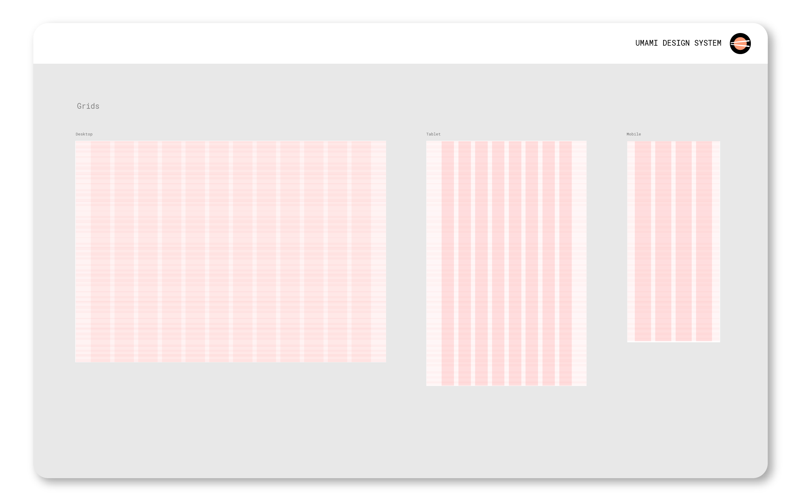
Desktop grids have 12 columns, tablets 8, and mobile 4 with 2 pixels rows for a more detailed layout.
Card design
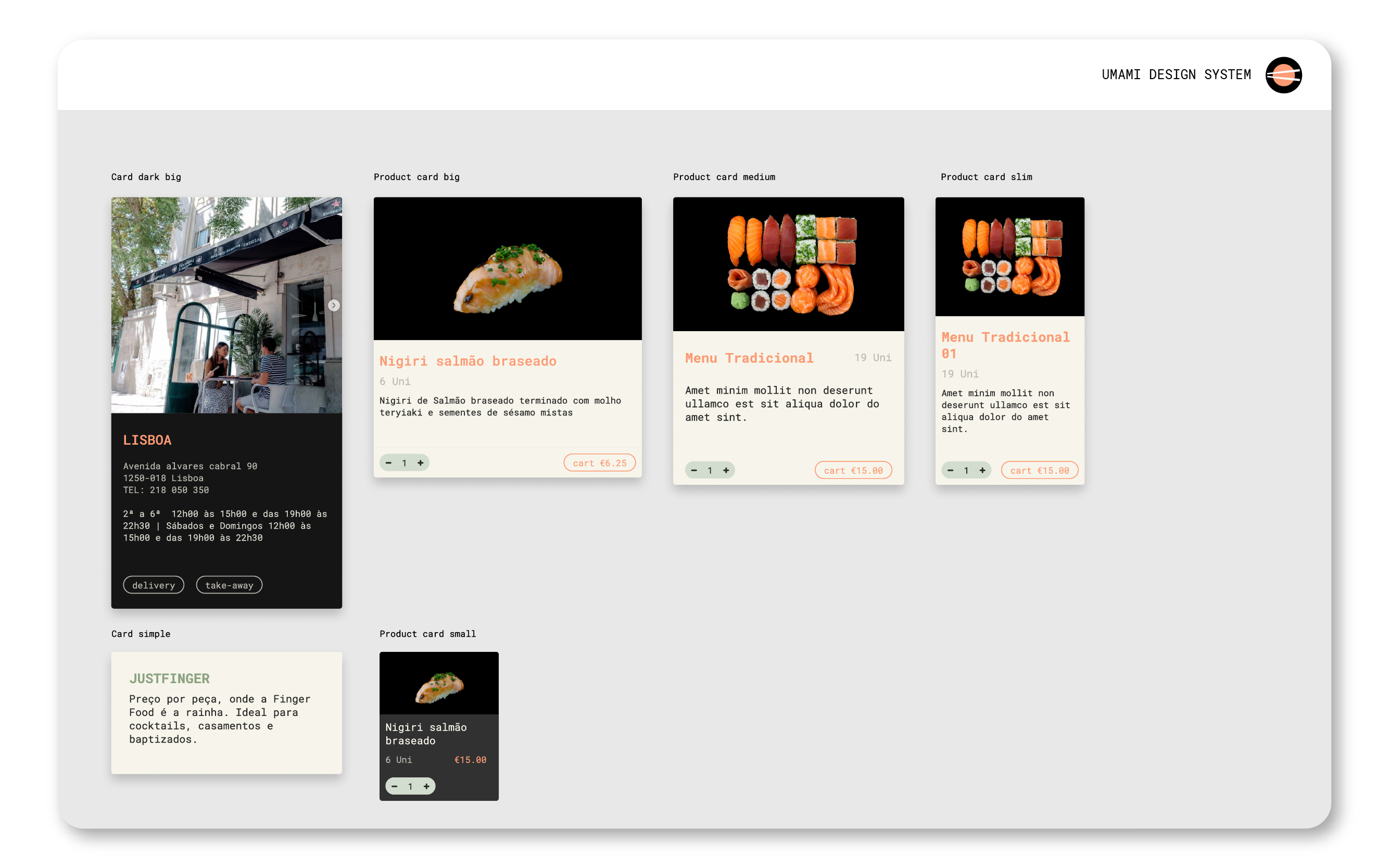
The main information of the online store where organized by cards. These cards assume some sizes and colors to be consistent with their task and information. They have vertical forms and horizontal, smaller, and larger ones to be most flexible when creating layouts. This card concept will be something transverse to other pages like the check-out and informative pages.

Components
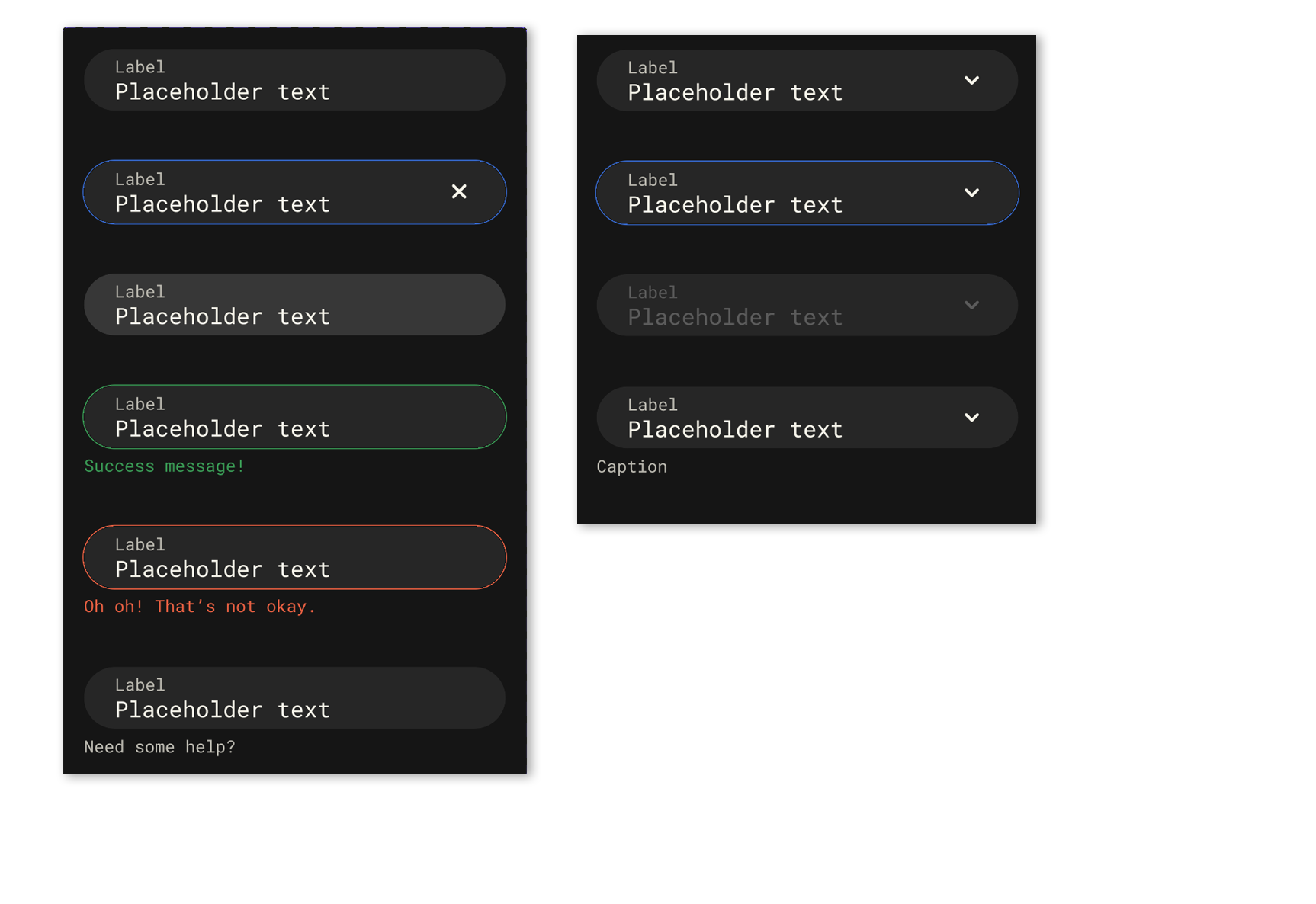
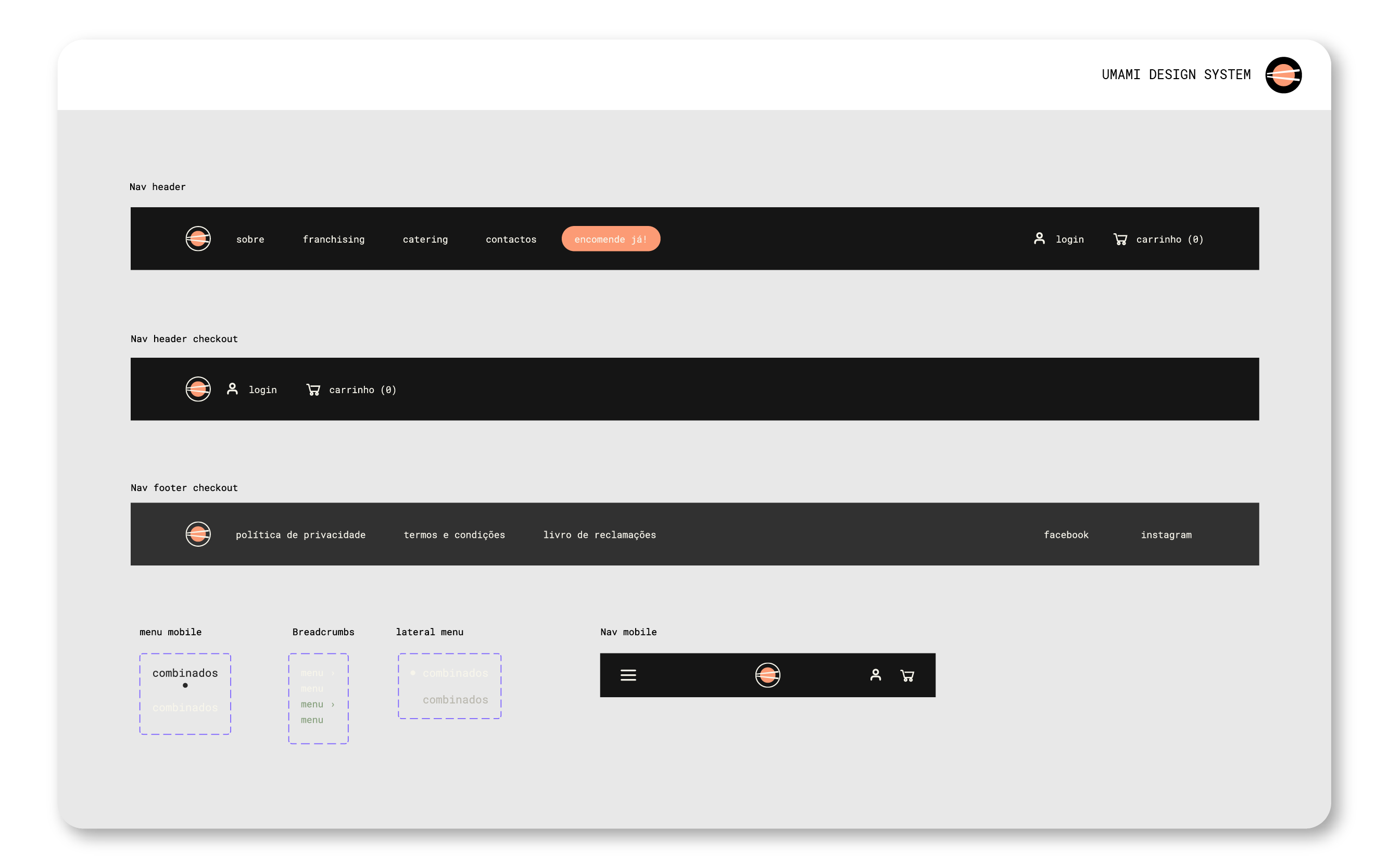
The layout and the components were created almost at the same time because of the objectiveness of the project and the necessity to go straight to a high-fidelity prototype.
The main components have several states developed to make sure all necessities are covered for the team of DevOps to be totally autonomous in creating new layouts.


